UI Component Drift
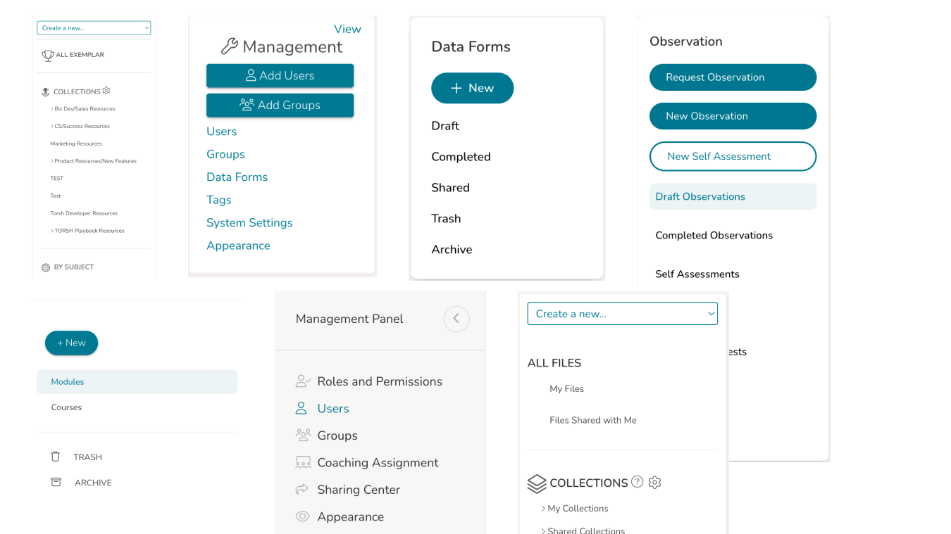
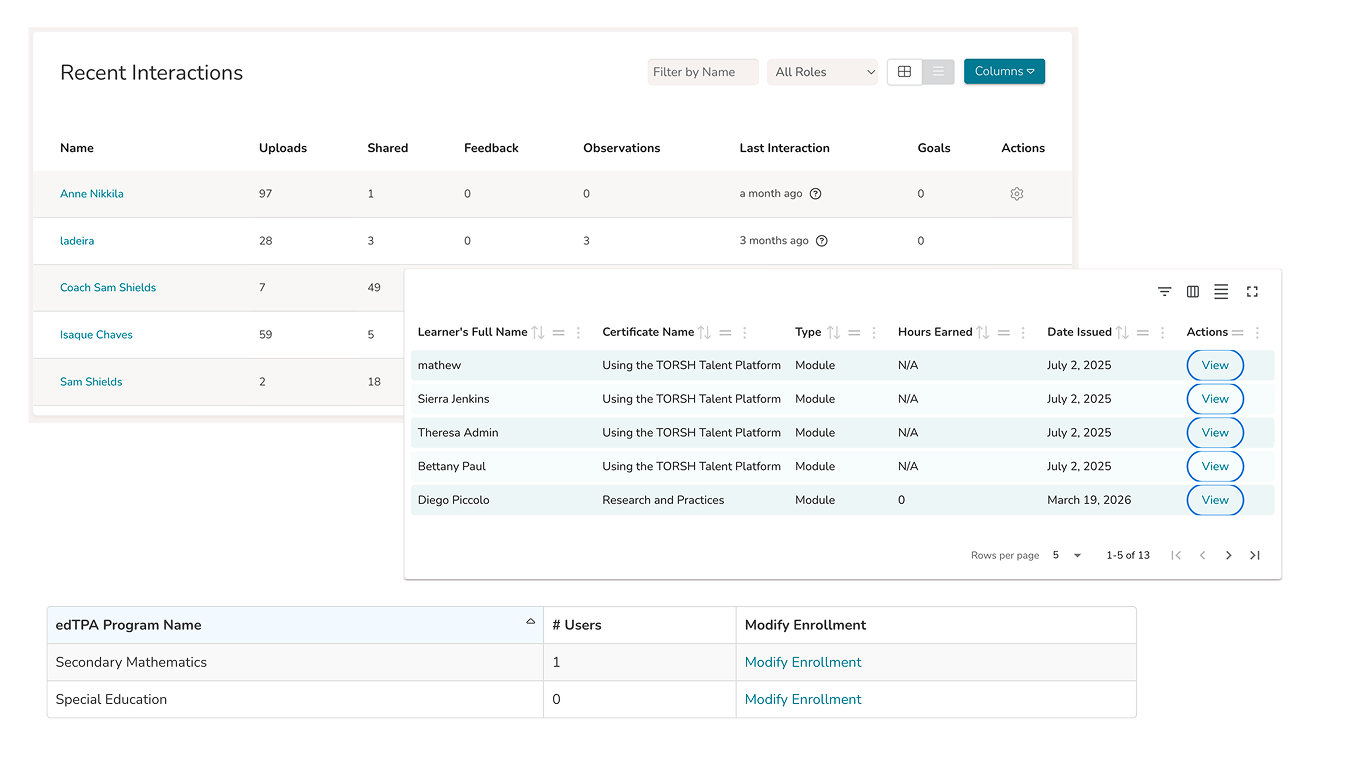
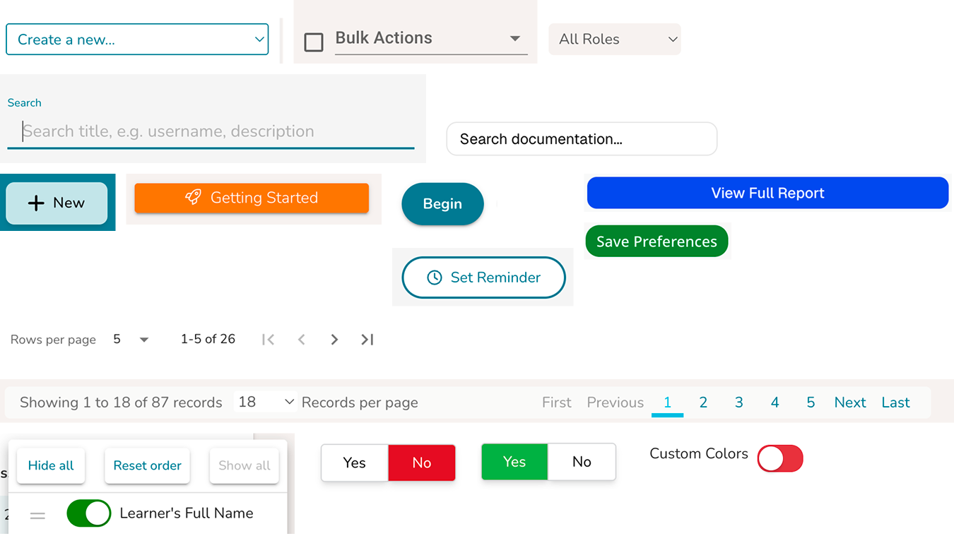
Core interface components diverged over time due to the absence of a shared system. Variations in styling, hierarchy, and interaction patterns reduced consistency and made the product harder to use and maintain.
The product had evolved over several years without a shared system. UI patterns were inconsistent, components were duplicated, and each new feature introduced more variation.
I introduced and built a design system from the ground up, working with a small team to create a unified, scalable foundation built on tokens, React, and Material UI.
Inconsistent UI patterns across the product led to duplication, confusion, and slower development.
Introduced a token-based system built on Material UI, connecting design and code through a shared foundation.
Led the design system end to end, from audit and architecture to implementation and team adoption.
The Problem
The product had been in development for about five years, evolving through team turnover and outsourced work. Over time, the interface drifted significantly.
Core interface components diverged over time due to the absence of a shared system. Variations in styling, hierarchy, and interaction patterns reduced consistency and made the product harder to use and maintain.
Users and Research
Through product audits and team conversations, a few patterns became clear:
The problem was not just visual inconsistency.
It was the absence of a system.
Without a shared foundation, both the user experience and the product development process continued to drift.
Plan and Tradeoffs
To move quickly while creating something that could scale, I focused on a few key decisions.
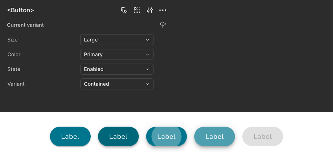
I chose Material UI to avoid rebuilding common components and to align design and engineering around a shared foundation.
Tradeoff
Less visual flexibility, but significantly faster development and stronger consistency.
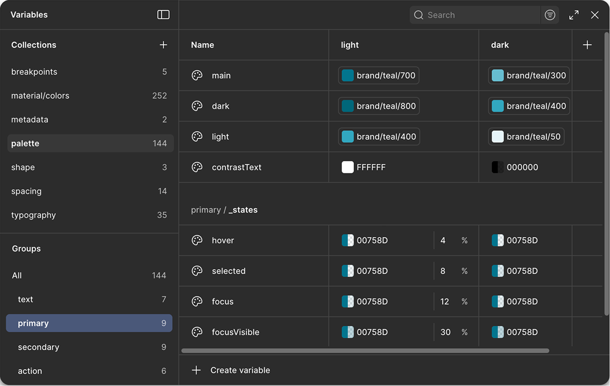
I created primitive and semantic tokens to define color, typography, and spacing across the system.
Tradeoff
Required upfront structure and team alignment, but ensured consistency across both design and code.
Using Tokens Studio, Style Dictionary, and Storybook, I ensured design decisions translated directly into production.
Tradeoff
Added initial setup complexity, but reduced long-term drift and rework.
Given the small team, I focused on clarity over completeness. The goal was a system people would actually use.
Tradeoff
Not everything was systemized upfront, but adoption was faster and more sustainable.
How We Worked
I partnered closely with a single developer to align on a technical foundation using React and Material UI.
At the same time, I mentored a junior designer to establish foundational system thinking, including primitives, semantic tokens, and component structure.
Together, we introduced a shared way of working across design and engineering.
What We Built
We created a system where every UI decision flows from a single source of truth, from design to code.
This removed inconsistencies and reduced the need for one-off solutions.
Design decisions in Figma are translated into production-ready components through tokens, a shared MUI theme, and reusable React components.
AI helps accelerate token transformation and component generation, while Storybook and Chromatic ensure consistency, documentation, and quality across teams.
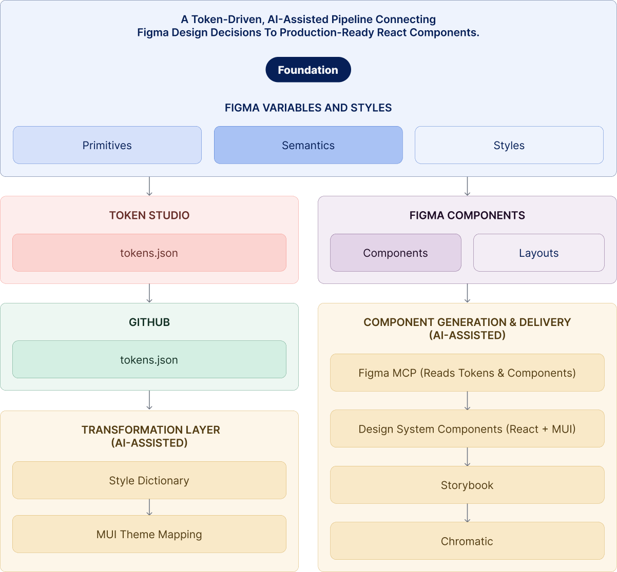
To support scalability, I introduced an AI-assisted workflow using Claude as part of the design system pipeline.
Working closely with engineering, we used Claude to interpret token updates, assist with mapping tokens to the MUI theme, and generate components aligned to the system.
The pipeline remained structured and deterministic, with clear rules around token usage, theme configuration, and component APIs. Claude operated within these constraints, supporting the system without introducing variability.
This approach accelerated development while maintaining consistency across the product.
Below is an example of how a single component moves through the system, from design tokens in Figma to a production-ready React component.
color.background.primary → blue.600
color.text.inverse → white
spacing.padding.md → 12pxpalette.primary.main = tokens.color.background.primary<Button variant="contained" color="primary">
Submit
</Button>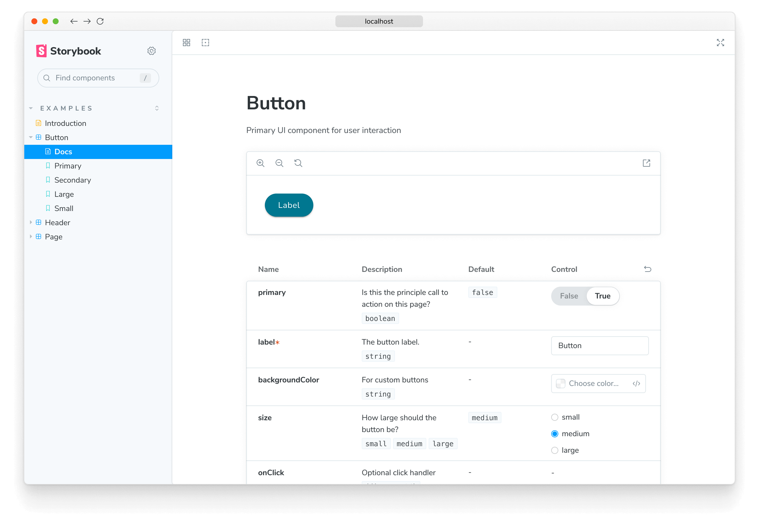
Storybook is the shared environment where design system components are documented, tested, and explored in isolation.
It allows teams to view each component across its variants, states, and properties, making the system easier to understand and use without relying on the full product context.
In this system, Storybook serves as the source of truth for how components behave in code, ensuring consistency between design and implementation, improving collaboration between design and engineering, and reducing ambiguity during development.
Paired with Chromatic, Storybook also enables visual testing and publishing, allowing teams to review changes and maintain quality as the system evolves.
Storybook provided a shared reference for how components were built and used. To support adoption beyond documentation, I worked with design, engineering, and product to establish a lightweight governance workflow.
This ensured new patterns were introduced intentionally, aligned to the system, and consistently implemented across the product.
Results
Reflections
This work reinforced that design systems are not defined by the size of a team, but by the clarity of decisions and the discipline to apply them consistently.
The core challenge was not scale, but drift. Without a shared system, small decisions accumulated over time into inconsistency, slowing both the user experience and the team's ability to build.
Introducing a design system created more than consistency. It established a shared foundation for how the team worked and made decisions.
This led to:
The most important shift was not the components themselves, but the shared understanding behind them. When teams have clarity, consistency follows.
Design systems are not just about UI. They are about enabling teams, aligning decisions, and creating a foundation for sustainable product growth.